Design3 min read
The crest is the logo
Fizz spent a while with a wordmark and a crest doing the same job in different places. Only one of them survived.
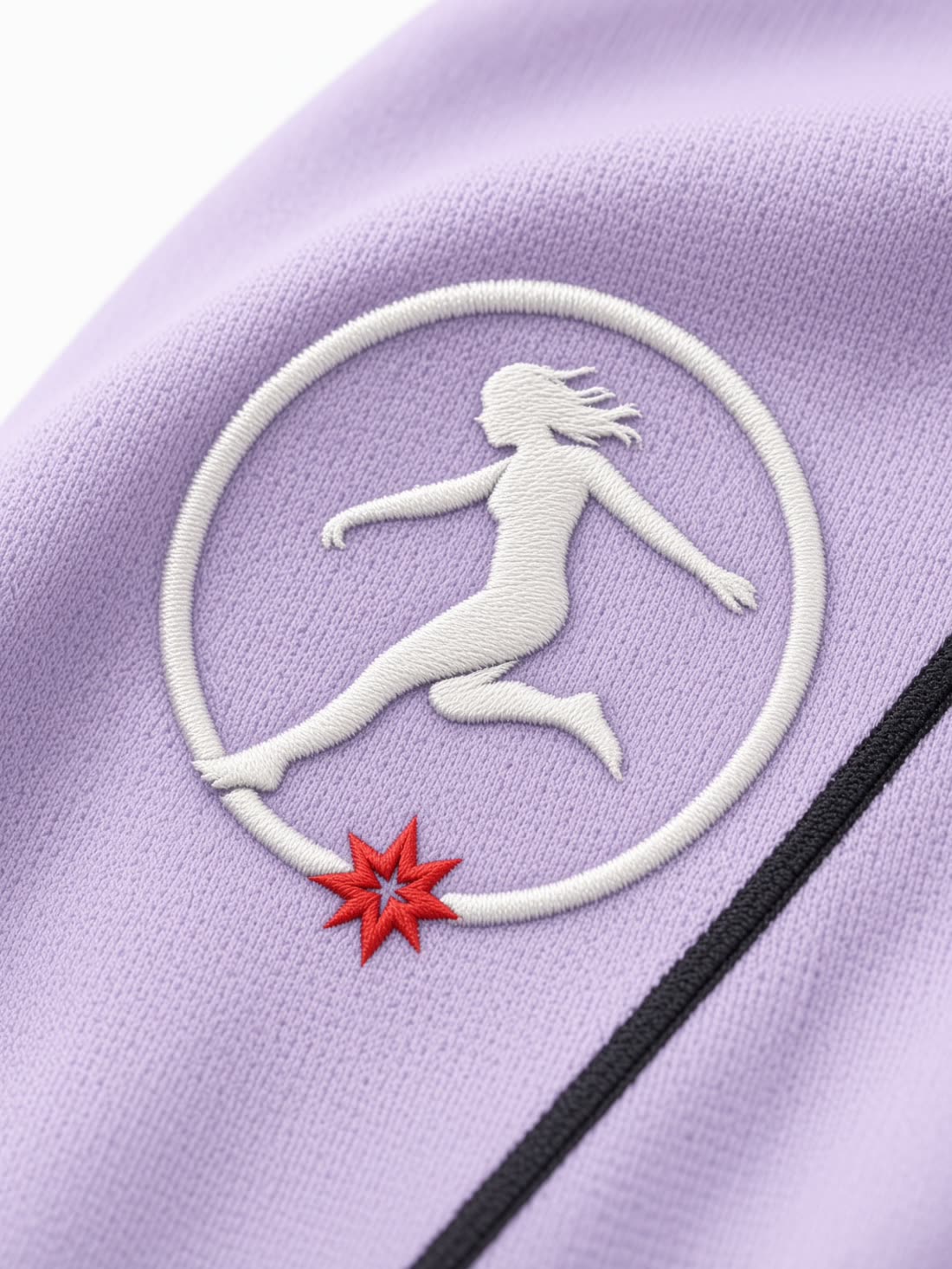
A brand with two marks has no mark. It has a preference that changes depending on who last opened the file.
For a stretch this site ran a typeset wordmark in the navigation and the crest on the garment. Both said Fizz. Neither agreed on how. The wordmark also carried a quiet risk that only shows up in production: set in a webfont, it becomes whatever the fallback is the moment that font fails to load, and a logo that renders in Arial on a slow connection is not a logo.
A brand with two marks has no mark.
What changed
The crest now appears everywhere the name is spoken visually — navigation, footer, favicon, garment. It is artwork, not type, so it cannot drift, cannot resolve to a fallback, and does not need a font to arrive before it is correct. There is a light version for dark grounds and a dark version for paper, and nothing else.
One exception, on purpose
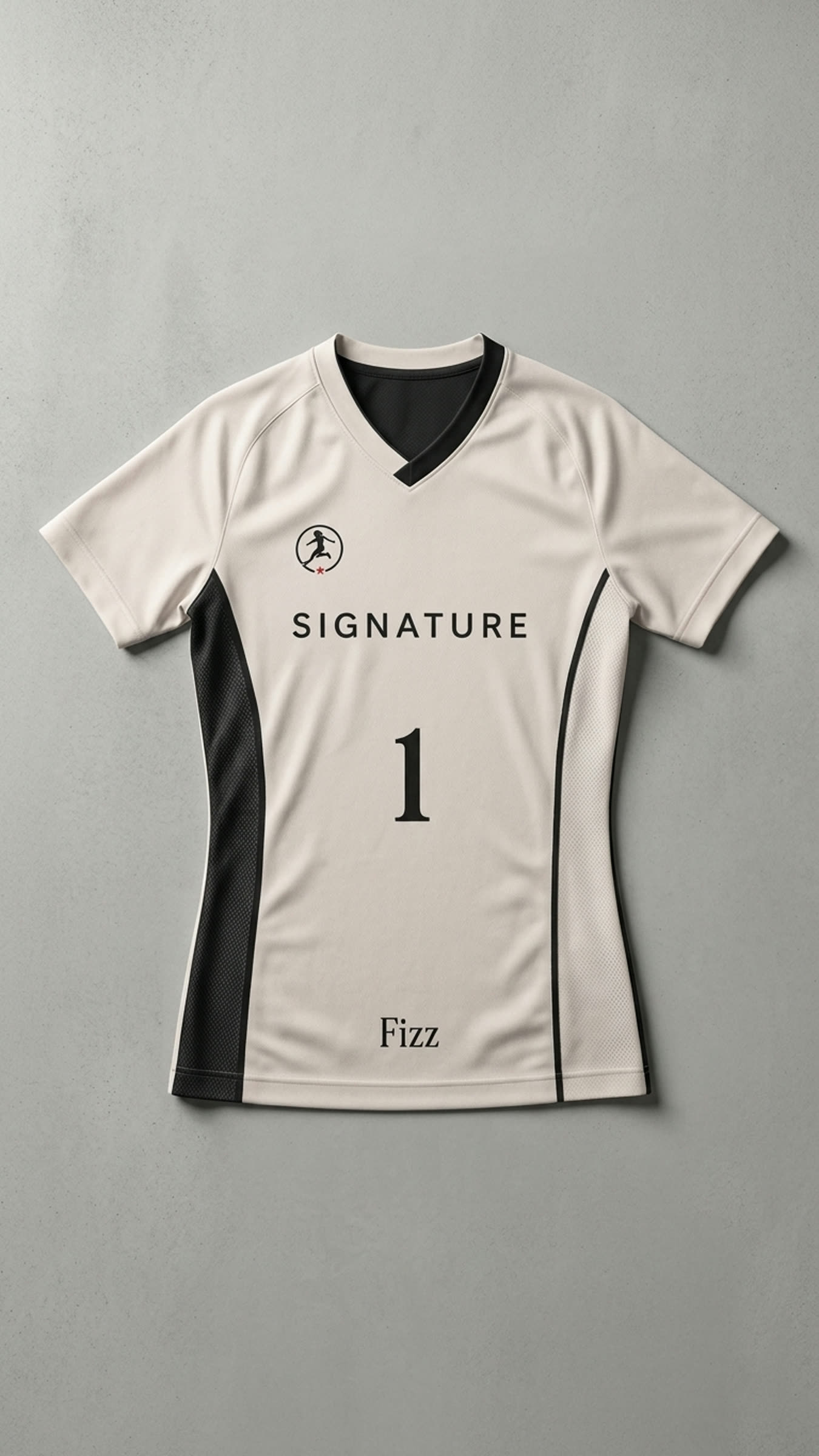
The jersey itself carries the crest at the chest and the name in serif at the hem. Two marks on one garment would normally break the rule above. On a shirt it reads as a maker's mark rather than a second logo, the way a boot carries a badge and a size stamp. It stays.